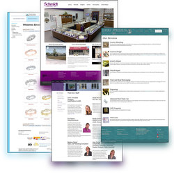
 A store’s jewelry website design feels personal. It is a sense of accomplishment, pride, and the statement that an owner feels when they have their grand opening, and with the tether of that grand opening lasting forever.
 Culturally, we are tied up in identity and the struggle of being unique while finding common ground between us. We want to feel special, encourage our customers to feel special, but at the same time recognize that it is a universal similarity that connects us. If that sounds heady and existential, well, it is! There is a whole psychology in marketing, in terms of what colors resonate and what textures conjure emotion.
This is compounded by the jewelry consumer having a number of pre-set grievances when they find you. They will already be expecting any number of features, customer service options, and a deep need to feel in control and prepared. You as the business owner face this every day in person, whether you are at a tradeshow or with a couple who have different ideas of what the perfect ring should cost. Your goal then is to reassure, to identify with them, and to make them feel like their questions and concerns are valid, but not insurmountable.
When we work with jewelers, we know all that is coming and we want to do the same for you. Together, we will analyze what works in your store that only you know about, and what we know: how to put it online in an accessible, friendly, and effective manner.
We want to encourage you to feel unique and special in the jewelry market, and you are—you serve your customers with your own personal flare. However, we also must acknowledge what makes you the same, which strengthens the jewelry industry. Jewelry professionals already agree on the 4 Cs, the price of gold, the monthly birthstones, and various other standards in the industry; it is time to realize the industry standard is not being met or unified on the web.
With photography, we can make nearly any design function to a higher level because it’s the usage that is most key to setting you apart. What you have is the expected chalk outlines of any site: header, footer, body, top menu, side menu, and the layouts page per page.
Your website design is a personal thing and it’s easy to get stuck in your head about it. Many people will compromise on the shade of paint on the walls, the lighting fixtures that they’ll have to deal with, and the carpet that is the best of limited options, but something about internet technology makes people really invested in perfection.
Sometimes I think that’s because it seems like it’s something you just fill in with a button shaped like a paint bucket and that it is dragged with a mouse to arrange the style. You throw in the concept of “custom design,” and the options seem endless—and exhausting.
I’ll put this into perspective: custom design is a sham. You are not going to have a unique idea for what the website looks like that is so out of the box that a professional website designer says “I’ve never seen that before.” You want a professional website designer to have “seen everything,” but not be jaded; one who can see promise and a unique quality in what can sometimes seem a monotonous, sterile vocation (menu… footer… header… body… and repeat).
But if they say “I’ve never seen that before,” catch their expression if you can as it’ll tell you one of two things: they’re amazed and enchanted or they’re utterly baffled because that’s a terrible idea. Sometimes designers will let it go to its logical conclusion, and allow your pipedream to span months of hourly custom design work and then reach the point of unfeasible. Sometimes they’ll make the closest approximation possible, and sometimes they’ll flat out say “That’s not what customers want.”
In all of those instances, it’s important to recognize they do know their jobs, and they know why things work they do. If a designer or programmer says “I can make something your customers have never seen before,” hesitate and then maybe run for the hills. You don’t want your customers to have no idea what they’re looking at.
Business owners forget that in every other facet of their lives, they are consumers. So largely what you want and expect in a website is what you should aim for in your own. You want to be able to see clearly, find easily, and accomplish dutifully all of the tasks; research, evaluation, and purchase.
So, take into account your brand identity as it stands; you have colors you gravitated towards, textures you’ve utilized, and you should gather pretty quickly that it’s almost always going to come down to photography. Everything else will generally fall into place, because when we decide on the shades and finish that appeal to you and resonate with your business, it will come alive with the words that describe your passion, and the imagery that define the quality of your work.


